
Adapting to Mobile: The Importance of Responsive Design in Malaysia's Digital Landscape
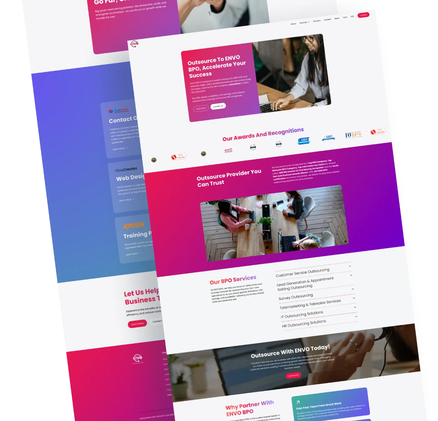

Mobile responsiveness in web design is a must-have. With a significant portion of the population accessing the internet through smartphones and tablets, businesses must adapt their websites for mobile devices. Here, we explore the importance of responsive design in Malaysia and offers practical tips for creating mobile-friendly websites that not only appeal to users but also positively impact search engine rankings.
The Mobile-First Reality in Malaysia
Malaysia boasts a high mobile penetration rate, with the majority of internet users accessing online content through their mobile devices. This shift to mobile browsing has immense implications for businesses. Websites that aren't mobile-friendly risk alienating a large segment of their potential audience, resulting in lost opportunities and revenue.
Key Aspects of Responsive Web Design
Responsive web design ensures that a website looks and functions seamlessly across all devices, regardless of screen size or operating system. This involves a fluid grid layout, flexible images, and media queries in CSS to adjust the layout based on the device's screen size.
Tips for Creating Responsive Designs
- Start with a Mobile-First Approach: Design for smaller screens first, then scale up for larger screens.
- Use Flexible Grid Layouts: Ensure that your website's layout adjusts smoothly to different screen sizes.
- Optimise Images and Media: Ensure that images and videos are not only high quality but also load efficiently on mobile devices.
- Implement Touch-Friendly Navigation: Make sure buttons and links are easily clickable and navigation is streamlined for touch screens.
Impact on Search Engine Rankings
Google's shift to mobile-first indexing highlights the importance of responsive design for SEO. Websites that are mobile-friendly tend to rank higher in search results, as they provide a better user experience. This is particularly crucial in Malaysia, where a significant portion of online searches are conducted on mobile devices.
User Experience and Engagement
Responsive design directly affects user experience and engagement. A mobile-friendly website invites longer visits, lower bounce rates, and higher conversions. It's about providing a seamless experience to users, regardless of how they access your site.
In conclusion, embracing responsive web design is critical for businesses in Malaysia to remain competitive in the digital age. By ensuring that websites are adaptable to mobile devices, businesses can enhance user engagement, improve search engine rankings, and ultimately, drive growth and success in the online realm.
Website Credibility Checklist
Score your firm's website in 15 minutes
25 yes-or-no checks that prospects make before they contact a law, accounting, consulting or finance firm. Your score shows where the site loses enquiries.
Keep reading

The Impact of Colour Psychology in Malaysian Web Design

Team Page Design for Professional Firms: What Wins Client Trust

Step into the Future: Augmented Reality for Engaging Malaysian Websites
Find out if we're the right fit for your business
We take on about ten projects a year. Answer six short questions and we'll tell you if your project is a fit.